Panel Layouts
A simple layout scheme allkows rich content to be created
Modern day websites are built to be mobile friendly. So they can be viewed on a mobile device as easily as being viewed on a large PC screen. The content is coded so that it will resize to fit the viewing device and not hamper the user's viewing experience.
The solution uses a row and column layout system. With one column per row on mobile devices, expanding to four on large screens and a middle two column layout. You decide on the large column width when adding in a panel. This allows you to create fluid page designs.
The following are samples of how that can work, this panel is a four width panel. This panel will always be fill width of the screen
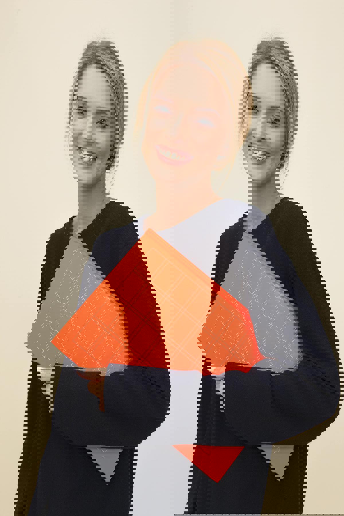
Next we will have a pair of two width panels.
Two width panel
The two width panel will take up half the row going from the medium width to large.
Lorem ipsum dolor sit amet, consectetur adipiscing elit. Integer id dui mattis nunc auctor bibendum volutpat et tellus. Ut accumsan vel massa non molestie. Mauris fermentum magna enim, eu sagittis nibh rhoncus et. Aenean nulla elit, pharetra ac cursus in, fringilla eu ipsum. Sed ut finibus diam. Sed pharetra arcu ac hendrerit gravida. Suspendisse lacinia in orci vitae interdum. Ut non nibh sed mi consequat vehicula at convallis dui. Quisque viverra volutpat tellus, vel volutpat felis.
Sed malesuada laoreet arcu a tincidunt. Praesent eleifend est enim, vulputate vestibulum ligula lacinia sed. Fusce interdum sed libero eget aliquet. Mauris velit ligula, porta sit amet pellentesque at, auctor et dui. Pellentesque venenatis cursus lorem, eu consectetur purus scelerisque eu. Donec non malesuada enim. Ut blandit scelerisque ipsum vitae pulvinar. Duis rutrum tempor lacinia. Nunc neque nisi, aliquam in justo et, sollicitudin laoreet orci. Nulla leo risus, posuere ut urna quis, sodales ullamcorper sem. Donec tempus imperdiet nunc id lacinia.


With the four width limit on a row you should always try and add your panels so that you have a row that adds up to four. So a one and three are a good pairing. If you try and add a two and a three then the three panel will carry over to a new row.
Nunc neque nisi, aliquam in justo et, sollicitudin laoreet orci. Nulla leo risus, posuere ut urna quis, sodales ullamcorper sem. Donec tempus imperdiet nunc id lacinia. Nam eu odio viverra urna tincidunt feugiat sed eget nulla. Ut et viverra odio, sit amet molestie ligula. Nam eget vestibulum ligula, a iaculis dui. Sed eu porttitor nulla. Cras nibh sapien, varius id felis a, posuere aliquet ipsum.


Panel finishes
There are also different finishes that you can apply to a panel as well.Plain, Info box or card, examples of which have been used in this page.